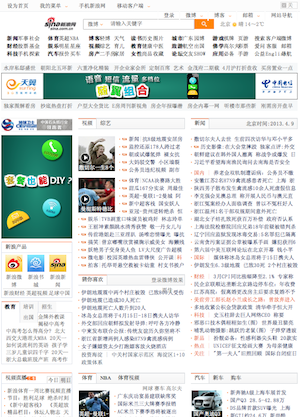
Website design in China
September 30, 2007, [MD]
 I TA for a class on International Studies and International Communication,
and this week we touched upon the concept of whether there was one
universal standard for web aesthetics, or whether it varied according to
cultural region. I notice very clearly when browsing Chinese websites,
for example, that they are a lot denser than what I am used to (of
course, my lack of reading speed aggravates this feeling) - in class I
gave the example of comparing The Guardian,
an English newspaper, and the Chinese website of the People’s
Daily, and the difference is quite striking.
The Guardian chooses a few stories to feature, and gives us the
headline, perhaps a small picture, and a few lines of ingress, while the
People’s Daily just lists one headline after another - seemingly want to
present a direct link to every single page on the whole site, on the
front page. This is not an isolated example, and the same is true of
other kinds of web pages, like the university website for Huazhong
University of Science and Technology
(华中科技大学).
After mentioning this to a friend, she gave me links to a few blogposts (here, and here) that referenced an academic study by Hans-Jürgen Bucher about how Chinese use the internet, and whether there is a “Chinese Internet”. He talks briefly about the discourse around the internet within China, how it is mostly used for fun (gaming, chatting) and how it is often mentioned as a menace to the young - the new opium (certainly I remember reading stories in the newspaper when I lived there, about girls who traveled to another city to meet their online love, and were abused, or of people spending forty hours straight in internet cafes, etc). He also looks at the design aesthetics, how Chinese both have the concept of “aesthetics of abundance” and “aesthetics of emptiness”:
In Chinese culture we can find two different kinds of aesthetical systems: the “aesthetics of abundance” and the “aesthetics of emptiness” (see Pohl 2004). Websites in China are usually designed along the principles of the “aesthetics of abundance” which refers to the Chinese popular culture and what can be seen in New Years pictures, calendars or paintings on dishes. The “aesthetics of emptiness” is part of the Chinese high culture and heavily influence by Zen and Chan Buddhism. The principles of this kind of aesthetics did not influence web design up to now in a significant way. The attractiveness of the “aesthetics of abundance” not only relies on its integration into popular culture but also on its symbolic meanings: strong and rich colour, density, and opulent presentation symbolize happiness and wealth.
Recently, a friend of mine forwarded a few links to different Web 2.0 sites in China that closely mirror the design of similar sites in the West:
- http://www.yo2.cn/ (我的优博网) - Wordpress
- http://fanfou.com/ (饭否) - Twitter
- http://xiaonei.com/ (校内网) - Facebook
- http://www.56.com/ - Youtube
- http://www.yupoo.com/ - Flickr
- http://www.xianguo.com/ (鲜果) - Bloglines
- http://www.diglog.com/ - Digg
So it will be interesting to see whether Chinese sites will start incorporating the Western clean, simple Web 2.0 aesthetics, or continue developing along their own path. I’d be interested in hearing of examples of different designs from other language/cultural groups.
Stian Håklev September 30, 2007 Toronto, Canada comments powered by Disqus